A custom kitchen website taken apart piece by piece
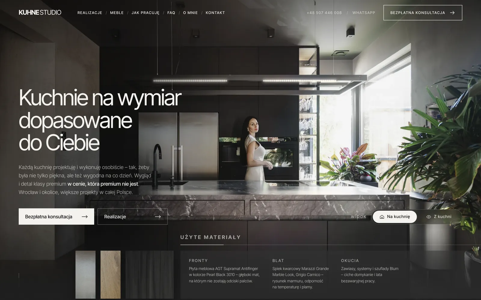
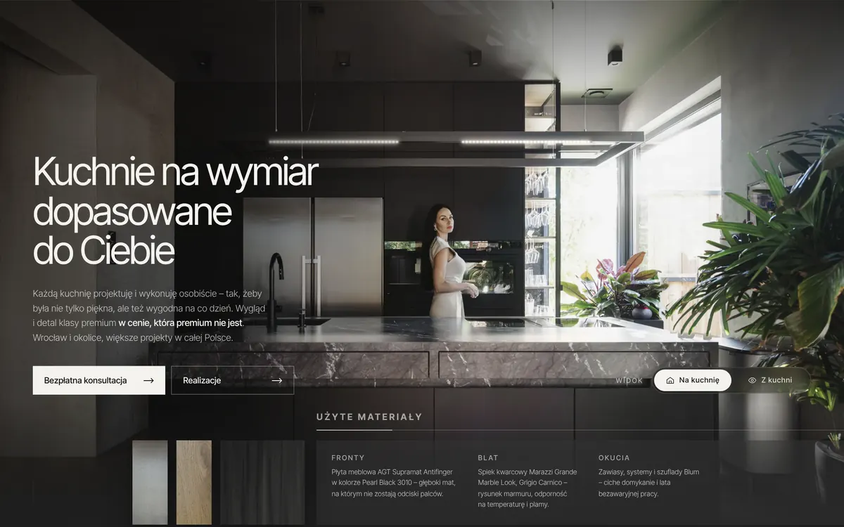
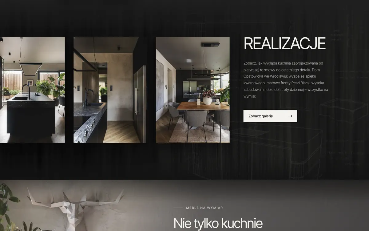
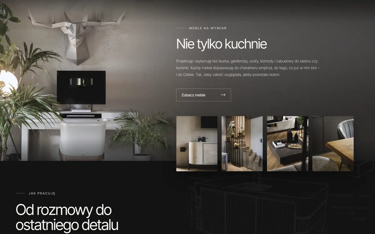
KUHNE STUDIO designs and builds custom kitchens in Wrocław. The website had to do what a good salesperson does in a showroom: impress from the doorstep, show real projects, ease concerns and make the client want to call. Below I show what parts it's built from – and why each of them matters.
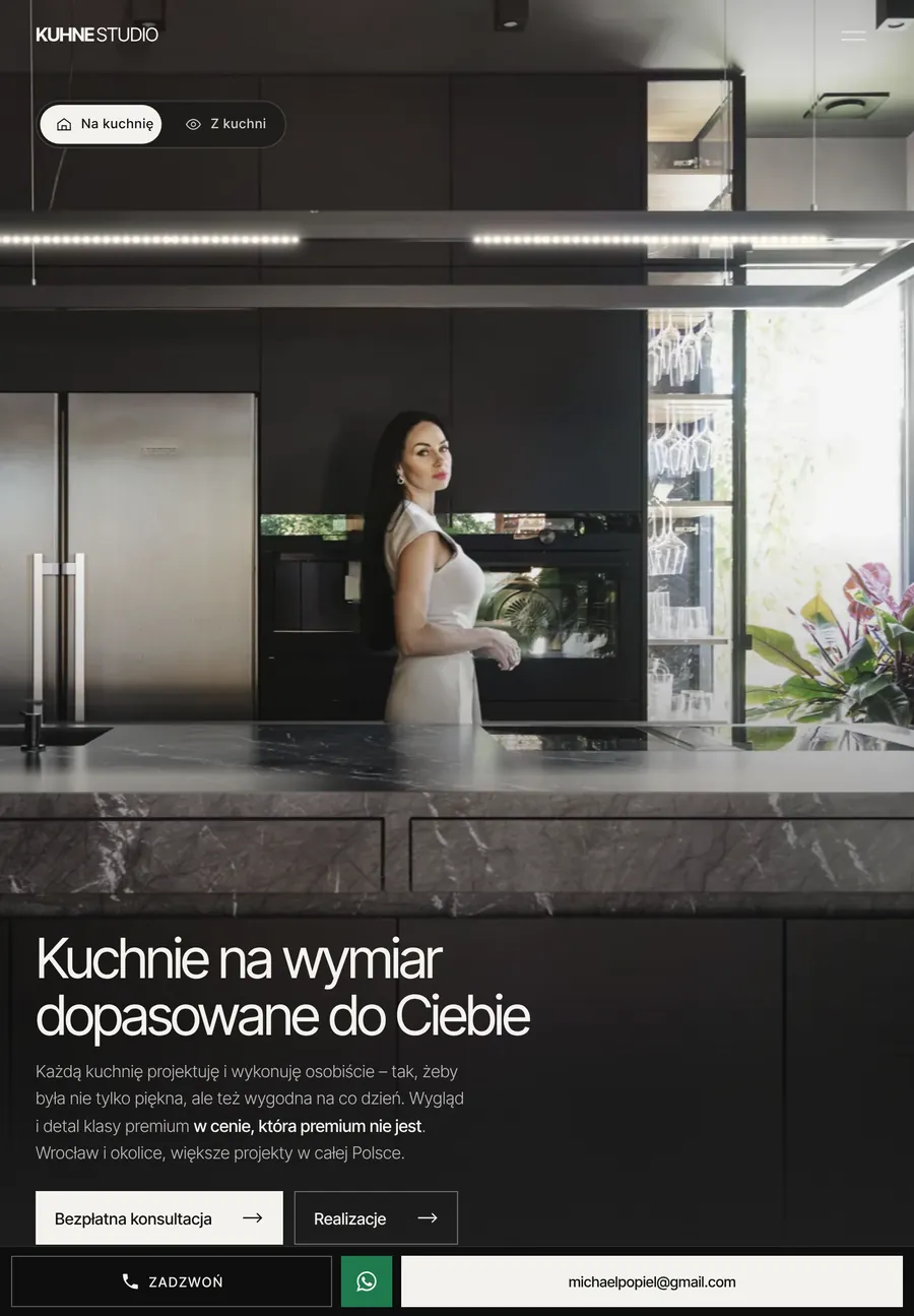
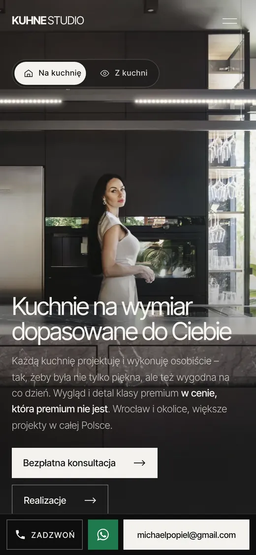
Clients usually browse kitchens in the evening on their phone and make the decision later at a computer – together with their partner. The website has to make an equally good impression on both.
That's why it isn't one website “squeezed” onto a small screen. On a phone the layout rearranges itself, the menu hides behind an icon, and at the bottom there's always a bar: Call · WhatsApp · e-mail. Just one tap separates the client from browsing to talking.
A real website, not a recording – play it or move the slider
4 perspective layers
The lamp switches on when you arrive
It dims as you scroll
Light reflected on the worktop
View switcherClick to change the view
The kitchen photo is cut into 4 layers: the background, the cabinets, the island and the plants in the foreground. As you scroll, each layer moves at a different speed – just like in a real room when you take a step to the side. The photo gains depth.
When you open the website, the lamps switch on above the island, and their reflection appears at the end of the worktop. As you start scrolling, the light gently fades. The “From the kitchen” switch shows the same interior from the other side. These aren't decorations: they catch the eye, build a sense of quality and keep the client on the website longer.
03 · Content as a story
A website that takes the client by the hand
The order of the sections isn't random. Each one answers a question the client is asking in their head – before they get the chance to ask it out loud.
01
First impression
“Is this for me?” – a beautiful photo and one clear sentence.
02
Proof
“Can they really do it?” – real projects, not catalogue photos.
03
More options
“What about a bedroom wardrobe?” – custom furniture broadens the offer.
04
What it looks like
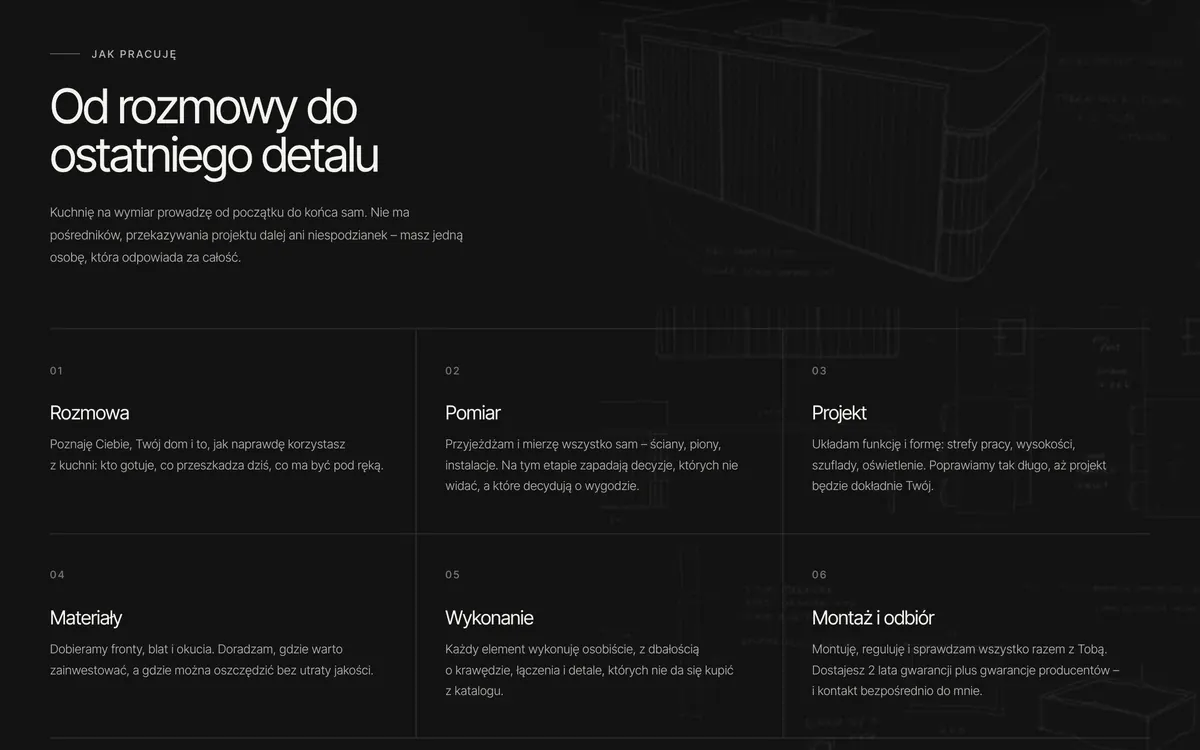
“What should I expect?” – six steps from the first conversation to installation remove uncertainty.
05
Answers
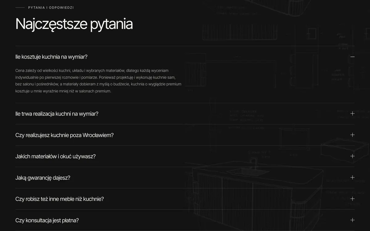
“How much does it cost? How long does it take?” – honest answers clear up doubts.
06
Who's behind it
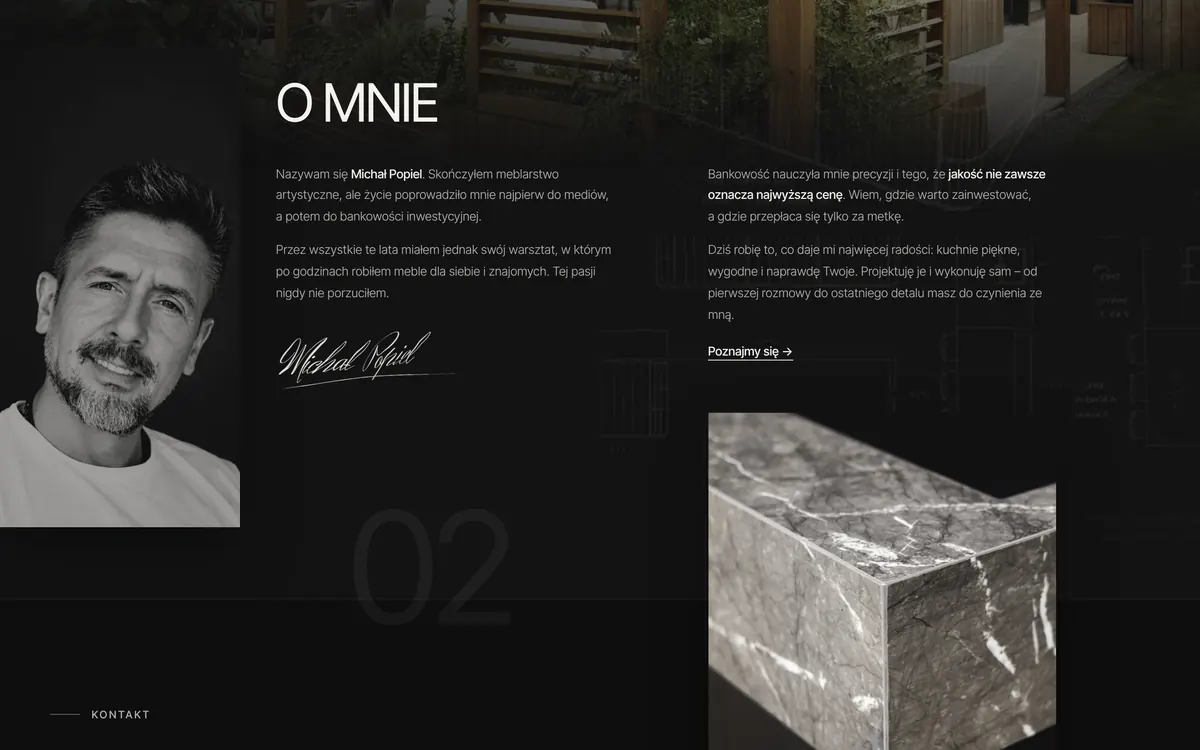
“Who am I trusting with my home?” – a face and a story build trust.
07
One step
“How do I start?” – phone, WhatsApp or e-mail. No long forms.
04 · Google and artificial intelligence
Visible to Google and to ChatGPT
Google and AI recommend websites that answer questions specifically. That's why, instead of empty slogans, the website has answers to what clients actually ask: how much a kitchen costs, how long it takes, which materials to choose. This kind of content can be added over time – every new guide is another question your company knows the answer to.
Search engines
100/100
SEO score in Google's test – on desktop and on mobile.
AI readiness
3/3
A new Google test that checks whether AI assistants can navigate the website.
Best practices
100/100
Security and correct functioning of the website according to Google.
More and more people no longer type anything into Google – they ask: “ChatGPT, recommend someone who makes custom kitchens in Wrocław”. The assistant answers based on what it finds online. If your website is unreadable to it – your company simply isn't in the answer.
That's why the website speaks two languages at once: an attractive one – for people, and a structured one – for machines. The client sees photos and text, while Google and AI get a precise “ID card” of the company underneath.
What's “under the hood”
A company ID card written in the language of search engines – who you are, where you operate, what you do.
7 questions and answers marked up so that Google and AI can quote them directly.
A step-by-step process described like instructions – AI loves using those.
An llms.txt file – a company business card prepared specifically for AI assistants.
An invitation for AI bots – ChatGPT, Claude, Perplexity and Gemini have open access.
A sitemap, titles and descriptions for every subpage, plus image descriptions.
# llms.txt – excerpt
# Custom kitchens and furniture
> Custom kitchens and furniture designed
> and made personally
> in Wrocław.
- Area: Wrocław and surroundings; larger
projects all over Poland.
- Materials: incl. matte anti-fingerprint fronts,
sintered quartz worktops, Blum fittings.
- Guarantee: 2 years on workmanship and installation.
# robots.txt – excerpt# Search engines and AI assistants – welcome
User-agent: GPTBot
Allow: /
User-agent: ClaudeBot
Allow: /
User-agent: PerplexityBot
Allow: /
05 · Languages and accessibility
A website that leaves no one out
Languages
4+
More and more people from other countries live and work in Poland – they're your clients too. A website can be prepared in several languages – another language isn't a new project, just an additional version of the same website. The Czarnecka Nieruchomości website already works in Polish, English and Russian.
Accessibility
97/100
The website is also comfortable for older, visually impaired or blind people: it has clear contrast, image descriptions for screen readers and full keyboard support. Anyone who has reduced motion turned on in their system gets a calm version without movement.
Image descriptions
19
Every image that shows something has a description. A screen reader will read it aloud to a blind person – and thanks to the same descriptions, Google knows what's in the photos and shows them in search results.
06 · Speed
Lots of photos and effects, and still fast
Desktop
1.3 s
That's how long it takes before the full hero section is visible.
Phone, slow internet
2.6 s
Google's test on a weak mobile connection.
Performance
96/100
Desktop performance score in Google's test.
A slow website means a client who goes back to Google and clicks on a competitor. And the kitchen website has full-screen photos, 4 parallax layers and lighting effects – everything that usually slows things down.
Still, it loads fast: the photos are in a modern, lightweight format and in several sizes (a phone doesn't download the version for a large monitor), and whatever isn't visible right away only loads as you scroll.
07 · Peace of mind for years
A lifetime guarantee on your website
If something I built stops working the way it did on the day the website was handed over – I'll fix it free of charge. No matter how much time has passed.
See what your new website could look like
Enter the address of your current website – I'll prepare a free preview of your new website and get back to you within 2 business days. No obligation. Prefer to talk? Message or call me.